主要是汇总几种关于多分类问题中的混淆矩阵可视化Python 实现.
最简单的一种是直接在终端打印混淆矩阵结果,如:
import sys

def confusion_matrix(gt_labels, pred_labels, num_labels):
    from sklearn.metrics import confusion_matrix

    conf_matrix = confusion_matrix(gt_labels, pred_labels, labels=range(num_labels))

    sys.stdout.write('\n\nConfusion Matrix')
    sys.stdout.write('\t'*(num_labels-2)+'| Accuracy')
    sys.stdout.write('\n'+'-'*8*(num_labels+1))
    sys.stdout.write('\n')
    for i in range(len(conf_matrix)):
        for j in range(len(conf_matrix[i])):
            sys.stdout.write(str(conf_matrix[i][j].astype(np.int))+'\t')
        sys.stdout.write('| %3.2f %%' % (conf_matrix[i][i]*100 / conf_matrix[i].sum()))
        sys.stdout.write('\n')
    sys.stdout.write('Number of test samples: %i \n\n' % conf_matrix.sum())
1. 示例1
From:sklearn plot confusion matrix with labels - stackoverflow
from sklearn.metrics import confusion_matrix

labels = ['business', 'health']
cm = confusion_matrix(y_test, pred, labels)
print(cm)
fig = plt.figure()
ax = fig.add_subplot(111)
cax = ax.matshow(cm)
plt.title('Confusion matrix of the classifier')
fig.colorbar(cax)
ax.set_xticklabels([''] + labels)
ax.set_yticklabels([''] + labels)
plt.xlabel('Predicted')
plt.ylabel('True')
plt.show()
2. 示例2
From:sklearn plot confusion matrix with labels - stackoverflow
http://scikit-learn.org/stable/auto_examples/model_selection/plot_confusion_matrix.html
def plot_confusion_matrix(cm,
                          target_names,
                          title='Confusion matrix',
                          cmap=None,
                          normalize=True):
    """
    given a sklearn confusion matrix (cm), make a nice plot

    Arguments
    ---------
    cm:           confusion matrix from sklearn.metrics.confusion_matrix
    target_names: given classification classes such as [0, 1, 2]
                  the class names, for example: ['high', 'medium', 'low']
    title:        the text to display at the top of the matrix
    cmap:         the gradient of the values displayed from matplotlib.pyplot.cm
                  see:
                  http://matplotlib.org/examples/color/colormaps_reference.html
                  plt.get_cmap('jet') or plt.cm.Blues
    normalize:    If False, plot the raw numbers
                  If True, plot the proportions
    Usage
    -----
    plot_confusion_matrix(cm = cm,
                           normalize = True, # show proportions
                          target_names = y_labels_vals, # list of classes names
                          title = best_estimator_name) # title of graph
    """
    import matplotlib.pyplot as plt
    import numpy as np
    import itertools

    accuracy = np.trace(cm) / np.sum(cm).astype('float')
    misclass = 1 - accuracy

    if cmap is None:
        cmap = plt.get_cmap('Blues')

    plt.figure(figsize=(8, 6))
    plt.imshow(cm, interpolation='nearest', cmap=cmap)
    plt.title(title)
    plt.colorbar()

    if target_names is not None:
        tick_marks = np.arange(len(target_names))
        plt.xticks(tick_marks, target_names, rotation=45)
        plt.yticks(tick_marks, target_names)

    if normalize:
        cm = cm.astype('float') / cm.sum(axis=1)[:, np.newaxis]

    thresh = cm.max() / 1.5 if normalize else cm.max() / 2
    for i, j in itertools.product(range(cm.shape[0]), range(cm.shape[1])):
        if normalize:
            plt.text(j, i, "{:0.4f}".format(cm[i, j]),
                     horizontalalignment="center",
                     color="white" if cm[i, j] > thresh else "black")
        else:
            plt.text(j, i, "{:,}".format(cm[i, j]),
                     horizontalalignment="center",
                     color="white" if cm[i, j] > thresh else "black")


    plt.tight_layout()
    plt.ylabel('True label')
    plt.xlabel('Predicted label\naccuracy={:0.4f}; misclass={:0.4f}'.format(accuracy, misclass))
    plt.show()
可视化图类似于:

3. 示例3
From:sklearn plot confusion matrix with labels - stackoverflow
https://gist.github.com/hitvoice/36cf44689065ca9b927431546381a3f7
import numpy as np
import pandas as pd
import matplotlib.pyplot as plt
import seaborn as sns
from sklearn.metrics import confusion_matrix
def cm_analysis(y_true, y_pred, labels, ymap=None, figsize=(10,10)):
"""
Generate matrix plot of confusion matrix with pretty annotations.
The plot image is saved to disk.
args:
y_true: true label of the data, with shape (nsamples,)
y_pred: prediction of the data, with shape (nsamples,)
filename: filename of figure file to save
labels: string array, name the order of class labels in the confusion matrix.
use `clf.classes_` if using scikit-learn models.
with shape (nclass,).
ymap: dict: any -> string, length == nclass.
if not None, map the labels & ys to more understandable strings.
Caution: original y_true, y_pred and labels must align.
figsize: the size of the figure plotted.
"""
if ymap is not None:
y_pred = [ymap[yi] for yi in y_pred]
y_true = [ymap[yi] for yi in y_true]
labels = [ymap[yi] for yi in labels]
cm = confusion_matrix(y_true, y_pred, labels=labels)
cm_sum = np.sum(cm, axis=1, keepdims=True)
cm_perc = cm / cm_sum.astype(float) * 100
annot = np.empty_like(cm).astype(str)
nrows, ncols = cm.shape
for i in range(nrows):
for j in range(ncols):
c = cm[i, j]
p = cm_perc[i, j]
if i == j:
s = cm_sum[i]
annot[i, j] = '%.1f%%\n%d/%d' % (p, c, s)
elif c == 0:
annot[i, j] = ''
else:
annot[i, j] = '%.1f%%\n%d' % (p, c)
cm = pd.DataFrame(cm, index=labels, columns=labels)
cm.index.name = 'Actual'
cm.columns.name = 'Predicted'
fig, ax = plt.subplots(figsize=figsize)
sns.heatmap(cm, annot=annot, fmt='', ax=ax)
#plt.savefig(filename)
plt.show()
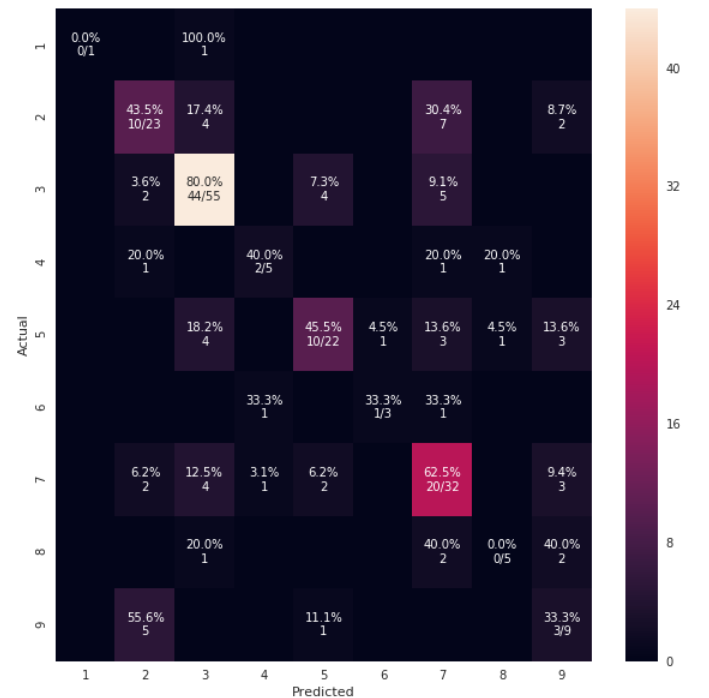
cm_analysis(y_test, y_pred, model.classes_, ymap=None, figsize=(10,10))可视化输出如:
4. 示例4
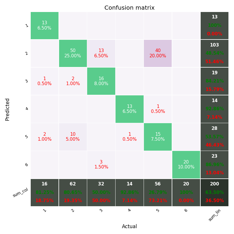
https://github.com/wcipriano/pretty-print-confusion-matrix
可视化图如:
5. 示例5
https://github.com/PacktPublishing/Artificial-Intelligence-with-Python/blob/master/Chapter%2002/code/confusion_matrix.py
import numpy as np
import matplotlib.pyplot as plt
from sklearn.metrics import confusion_matrix
from sklearn.metrics import classification_report

# Define sample labels
true_labels = [2, 0, 0, 2, 4, 4, 1, 0, 3, 3, 3]
pred_labels = [2, 1, 0, 2, 4, 3, 1, 0, 1, 3, 3]

# Create confusion matrix
confusion_mat = confusion_matrix(true_labels, pred_labels)

# Visualize confusion matrix
plt.imshow(confusion_mat, interpolation='nearest', cmap=plt.cm.gray)
plt.title('Confusion matrix')
plt.colorbar()
ticks = np.arange(5)
plt.xticks(ticks, ticks)
plt.yticks(ticks, ticks)
plt.ylabel('True labels')
plt.xlabel('Predicted labels')
plt.show()

# Classification report
targets = ['Class-0', 'Class-1', 'Class-2', 'Class-3', 'Class-4']
print('\n', classification_report(true_labels, pred_labels, target_names=targets))
6. 示例6
python实现混淆矩阵 - 知乎
from sklearn.metrics import confusion_matrix
import matplotlib.pyplot as plt
import numpy as np

def plot_confusion_matrix(cm, savename=None, title='Confusion Matrix'):
    plt.figure(figsize=(12, 8), dpi=100)
    np.set_printoptions(precision=2)

    # 在混淆矩阵中每格的概率值
    ind_array = np.arange(len(classes))
    x, y = np.meshgrid(ind_array, ind_array)
    for x_val, y_val in zip(x.flatten(), y.flatten()):
        c = cm[y_val][x_val]
        if c > 0.001:
            plt.text(x_val, y_val, "%0.2f" % (c,), color='red', fontsize=15, va='center', ha='center')

    plt.imshow(cm, interpolation='nearest', cmap=plt.cm.binary)
    plt.title(title)
    plt.colorbar()
    xlocations = np.array(range(len(classes)))
    plt.xticks(xlocations, classes, rotation=90)
    plt.yticks(xlocations, classes)
    plt.ylabel('Actual label')
    plt.xlabel('Predict label')

    # offset the tick
    #tick_marks = np.array(range(len(classes)+1)) - 0.5
    tick_marks = np.array(range(len(classes))) + 0.5
    plt.gca().set_xticks(tick_marks, minor=True)
    plt.gca().set_yticks(tick_marks, minor=True)
    plt.gca().xaxis.set_ticks_position('none')
    plt.gca().yaxis.set_ticks_position('none')
    plt.grid(True, which='minor', linestyle='-')
    plt.gcf().subplots_adjust(bottom=0.15)

    # show confusion matrix
    if savename:
        plt.savefig(savename, format='png')
    plt.show()

#
# classes表示不同类别的名称,比如这有6个类别
classes = ['A', 'B', 'C', 'D', 'E', 'F']

random_numbers = np.random.randint(6, size=50)  # 6个类别,随机生成50个样本
y_true = random_numbers.copy()  # 样本实际标签
random_numbers[:10] = np.random.randint(6, size=10)  # 将前10个样本的值进行随机更改
y_pred = random_numbers  # 样本预测标签

# 获取混淆矩阵
cm = confusion_matrix(y_true, y_pred)
plot_confusion_matrix(cm, 'confusion_matrix.png', title='confusion matrix')
可视化结果如图:

比如类别A,预测结果和实际标签都为A的有12个样本,把A样本预测为其他类别的有3个样本(同一行的其他样本),而把其他类别预测为A样本的有1个样本(同一列的其他样本).其他类别也同样这样分析.
7. 示例7 - 中文标注
#!--*-- coding=utf-8 --*--
import matplotlib.pyplot as plt
import numpy as np

confusion = np.array(([91,0,0],[0,92,1],[0,0,95]))
# 热度图,后面是指定的颜色块,可设置其他的不同颜色
plt.imshow(confusion, cmap=plt.cm.Blues)
# ticks 坐标轴的坐标点
# label 坐标轴标签说明
indices = range(len(confusion))
# 第一个是迭代对象,表示坐标的显示顺序,第二个参数是坐标轴显示列表
#plt.xticks(indices, [0, 1, 2])
#plt.yticks(indices, [0, 1, 2])
plt.xticks(indices, ['圆形', '三角形', '方形'])
plt.yticks(indices, ['圆形', '三角形', '方形'])

plt.colorbar()

plt.xlabel('预测值')
plt.ylabel('真实值')
plt.title('混淆矩阵')

# plt.rcParams两行是用于解决标签不能显示汉字的问题
plt.rcParams['font.sans-serif']=['SimHei']
plt.rcParams['axes.unicode_minus'] = False

# 显示数据
for first_index in range(len(confusion)):  #第几行
    for second_index in range(len(confusion[first_index])):  #第几列
        plt.text(first_index, second_index, confusion[first_index][second_index])
plt.show()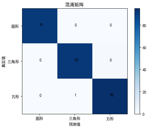
8. 示例8
https://github.com/JACKYLUO1991/Face-skin-hair-segmentaiton-and-skin-color-evaluation/blob/master/experiments/utils.py
def plot_confusion_matrix(y_true, y_pred, classes,
                          normalize=False,
                          title=None,
                          cmap=plt.cm.Blues):
    """
    This function prints and plots the confusion matrix.
    Normalization can be applied by setting `normalize=True`.
    """
    if not title:
        if normalize:
            title = 'Normalized confusion matrix'
        else:
            title = 'Confusion matrix, without normalization'

    # Compute confusion matrix
    cm = confusion_matrix(y_true, y_pred)
    if normalize:
        cm = cm.astype('float') / cm.sum(axis=1)[:, np.newaxis]
        print("Normalized confusion matrix")
    else:
        print('Confusion matrix, without normalization')

    fig, ax = plt.subplots()
    im = ax.imshow(cm, interpolation='nearest', cmap=cmap)
    ax.figure.colorbar(im, ax=ax)
    # show all ticks...
    ax.set(xticks=np.arange(cm.shape[1]),
           yticks=np.arange(cm.shape[0]),
           # ... and label them with the respective list entries
           xticklabels=classes, yticklabels=classes,
           title=title,
           ylabel='True label',
           xlabel='Predicted label')

    # Rotate the tick labels and set their alignment.
    plt.setp(ax.get_xticklabels(), rotation=45, ha="right",
             rotation_mode="anchor")

    # Loop over data dimensions and create text annotations.
    fmt = '.2f' if normalize else 'd'
    thresh = cm.max() / 2.
    for i in range(cm.shape[0]):
        for j in range(cm.shape[1]):
            ax.text(j, i, format(cm[i, j], fmt),
                    ha="center", va="center",
                    color="white" if cm[i, j] > thresh else "black")
    fig.tight_layout()

    plt.show()